Did you know that our logo used to be green?
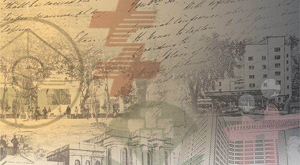
The TTSH logo has undergone a few changes over the past decades. The timeline below captures some of the key moments in our logo's history.
1970's
This logo was found in our newsletter dated January 1975. It could potentially be the first official logo of Tan Tock Seng Hospital – prior to this, the hospital name was likely represented in text form. Can you spot the "TTSH" in the logo?
1970's – 1980's
Still keeping the round frame, this version carried a more obvious abbreviation of "TTSH" than the previous logo. Interestingly, the corporate colour used was green.
1990s
This logo was launched in 1992. Dropping the letter "H", the logo reflected the abbreviation "TTS", which stands for Tan Tock Seng. Along with the transformation, we also adopted burgundy as our corporate colour.
2000s
We launched this logo a few months before we moved to our current site on 6 January 1999. It maintained the vibrant burgundy and the letters “TTS” from the 90’s, and depicted the partnership between healthcare professionals and the patient community.
As of 1 July 2025, our logo reflects the alignment of institutions’ identities across NHG Health as we create a more integrated and seamless healthcare system for the people we serve collectively. The graphic in the logo represents a vibrant individual journeying along the River of Life, symbolising our commitment to improving the health and well-being of our residents.
Read more here!
